Then and Now: The evolution of 23 fast food logos

The favorite restaurant chains of America may be quick at serving food, but they are more reluctant at change. If it ain't broke, why fix it? Still, some of these joints have been around for decades and they have slowly evolved over the years.
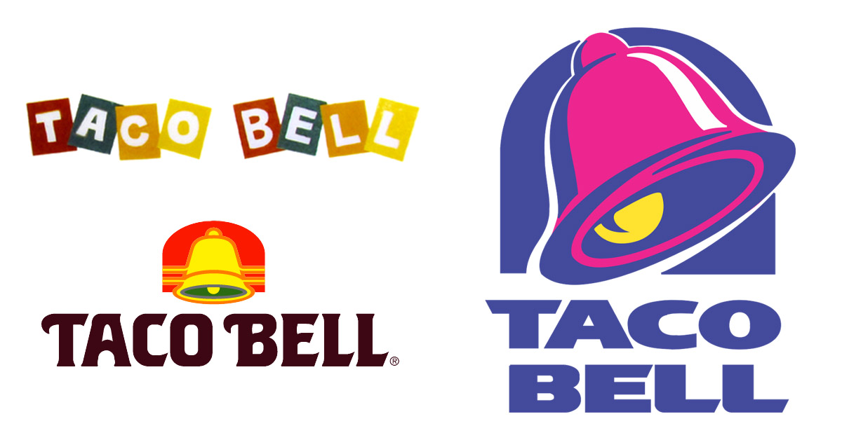
Sometimes, the transformations are extreme. Who remembers Pizza Pete or Taco Bell before it was purple and pink? Being who we are, we prefer the fonts, colors and cartoons of the bygone era. Let's take a look back at how some of the most familiar quick service restaurant brands have changed.
Do you remember these retro logos?
A&W

Image: Gregg Koenig / Flickr
The root beer and grub chain also featured the charming cartoon Burger Family — Papa Burger, Mama Burger, Teen Burger and Baby Burger.
Applebee's

Image: Logopedia
We remember the "T.J." before the Applebee's, but we don't recall the "Rx for edibles & elixers" bit. Sounds more like an apothecary.
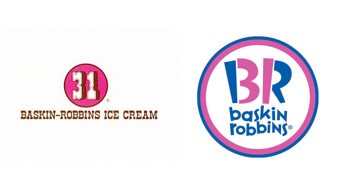
Baskin Robbins

Image: Logopedia
See how many of the 31 flavors you can name.
Burger King

Image: grayflannelsuit.net
The Florida-born giant began with more of a cartoon look, from its wordmark to the little king.
Carl's Jr.

Image: Logopedia
What a happy little star. He's still jolly, despite losing his feet.
Chick-Fil-A

Image: Logopedia
This reminds us of Foghorn Leghorn, whom we'd rather not eat.
Chili's

Image: Dallas News
More of a sit-down restaurant, Chili's does offer a To-Go. In any case, we wanted to include it. Though it looks printed up at a Kinko's, the original menu features a logo not too far off from the modern era.
Dairy Queen

Image: grayflannelsuit.net
We could go for a parfait right about now.
Domino's Pizza

Image: Domino's / Pinterest
The Michigan pizza chain began as Domi-Nick's. The three dots on the domino originally represented the number of locations.
Dunkin' Donuts

Image: Logopedia
They went from coffee colors to frosting colors.
Hardee's

Image: Logopedia
From super-'50s to super-'70s to… well, Carl's Jr.
IHOP

Image: Heather David / Flickr
Will children of the future even know what "IHOP" stands for?
Jack in the Box

Image: logomyway
Of course, there used to be a clown on a spring, as well.
KFC

Image: gothphotographer
The Colonel always looked like kind of a hipster.
Little Caesar's

Image: Little Caesar's / flyoverculturedotcom
The original name was "Little Caesar's Pizza Treat." They got out of the fish and shrimp game long ago.
Long John Silver's

Image: Logopedia
That looks a bit like Nemo. Aww, why'd you have to make us think of Nemo?
McDonald's

Image: Logopedia
Which was your favorite era? We dig the double arches look. The very first iteration, with the "Famous Barbecue" proclamation, gives some credibility to the McRib.
Pizza Hut

Image: Logopedia
Pizza Pete looked like a descendent of Little Caesar.
Sonic Drive-In

Image: grayflannelsuit.net
Now that is a cool logo. It looks as if it came right off a guitar amplifier.
Starbucks

Image: Logopedia
It's evolved from Herman Melville to Splash.
Subway

Image: Logopedia
New font, same arrows.
Taco Bell

Image: Logopedia
We miss the sunset palette, which matched the colors of the tomatoes, cheese and corn. The new color scheme matches a Barbie Dream House.
Wendy's

Image: Logopedia
She's not quite as "Old Fashioned" as she used to be.


